CLIENT
Rose Gold Health is a patient-focused preventive healthcare service at the comfort of a patient's home. Their goal is to promote a better quality of life.
PROJECT
Rose Gold Health needed a business card (front) and a trifold brochure to help promote their services to potential senior patients and health agencies for networking.
DELIVERABLES
3.5 x 2 inch business card (front) and 8.5 x 11 inch trifold brochure (front & back)
TOOLS
Adobe Indesign, Illustrator, and Photoshop
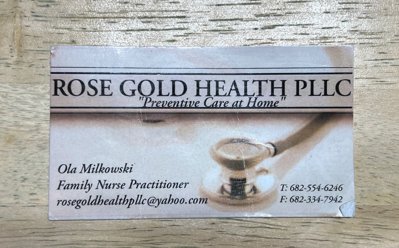
Original business card
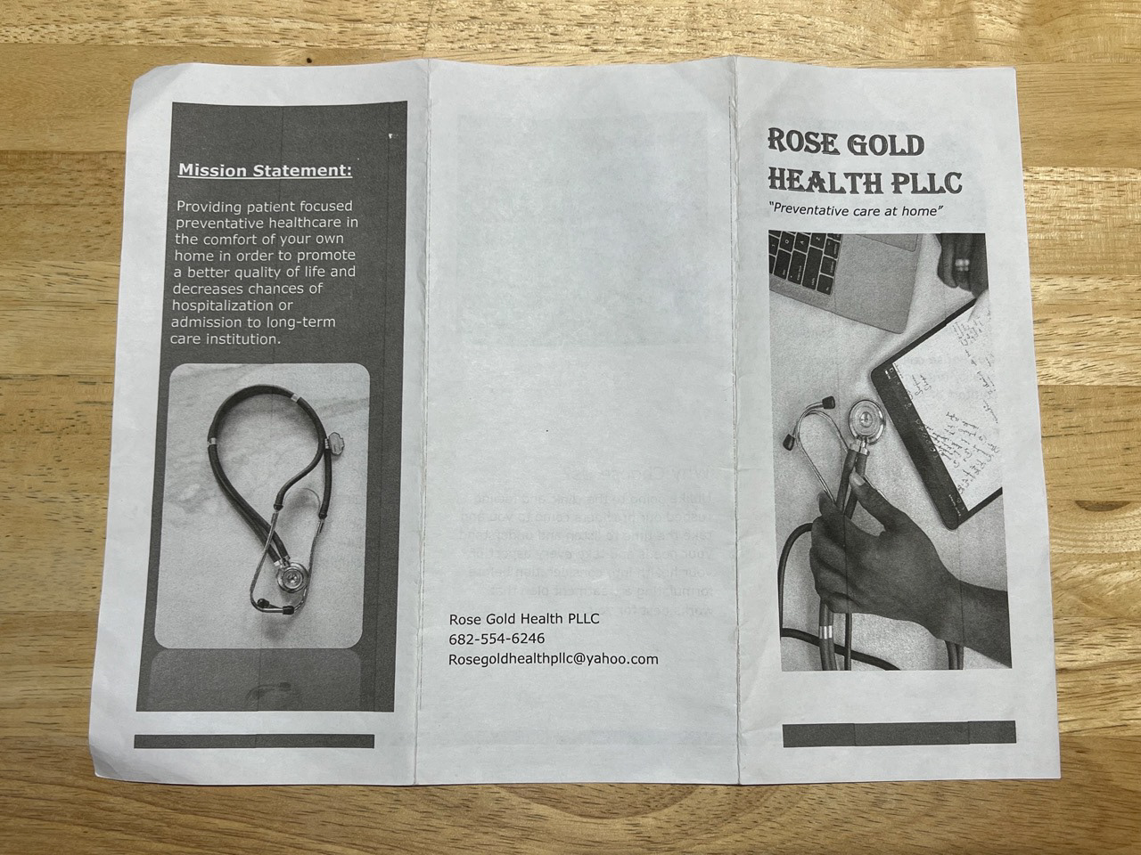
Original brochure front
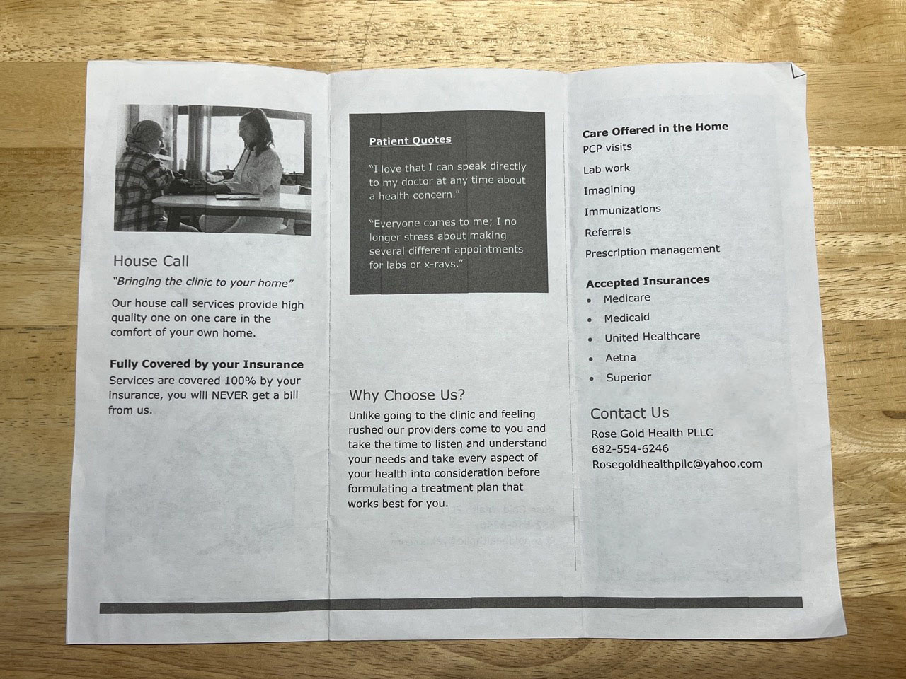
Original brochure inside
ORIGINAL DESIGNS
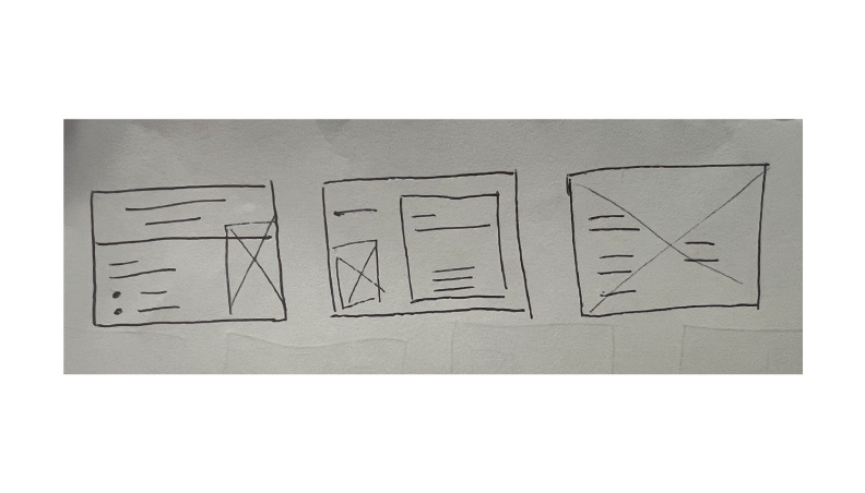
Business card sketches
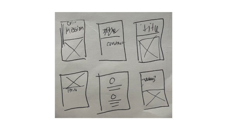
Trifold brochure sketches of front and inside part 1
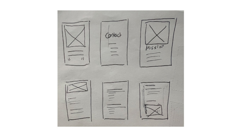
Trifold brochure sketches of front and inside part 2
SKETCHES
Creating a professional brand appearance and a simple legible layout for the senior target audience was my goal while sketching. It was important to create brand consistency in using the same elements in both designs.
COLORS
I selected this toasted golden rose color for a lighter hue and mauve rose color for a dark hue to mirror the business name “Rose Gold Health”. I selected white and black to help with readability on top of those rose gold colors.
TYPOGRAPHY
The Super Title typeface due to its varying font styles that are helpful for headings and emphasis on important words. The Robot typeface is great for the trifold brochure body text.
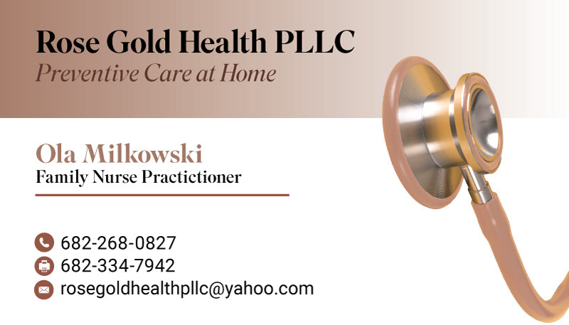
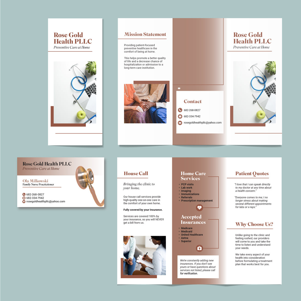
Final business card
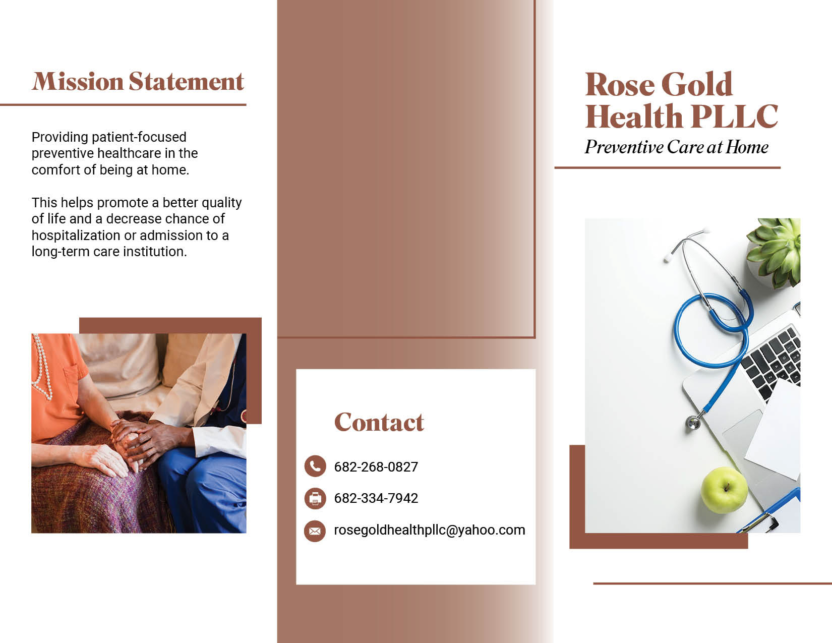
Final trifold brochure front
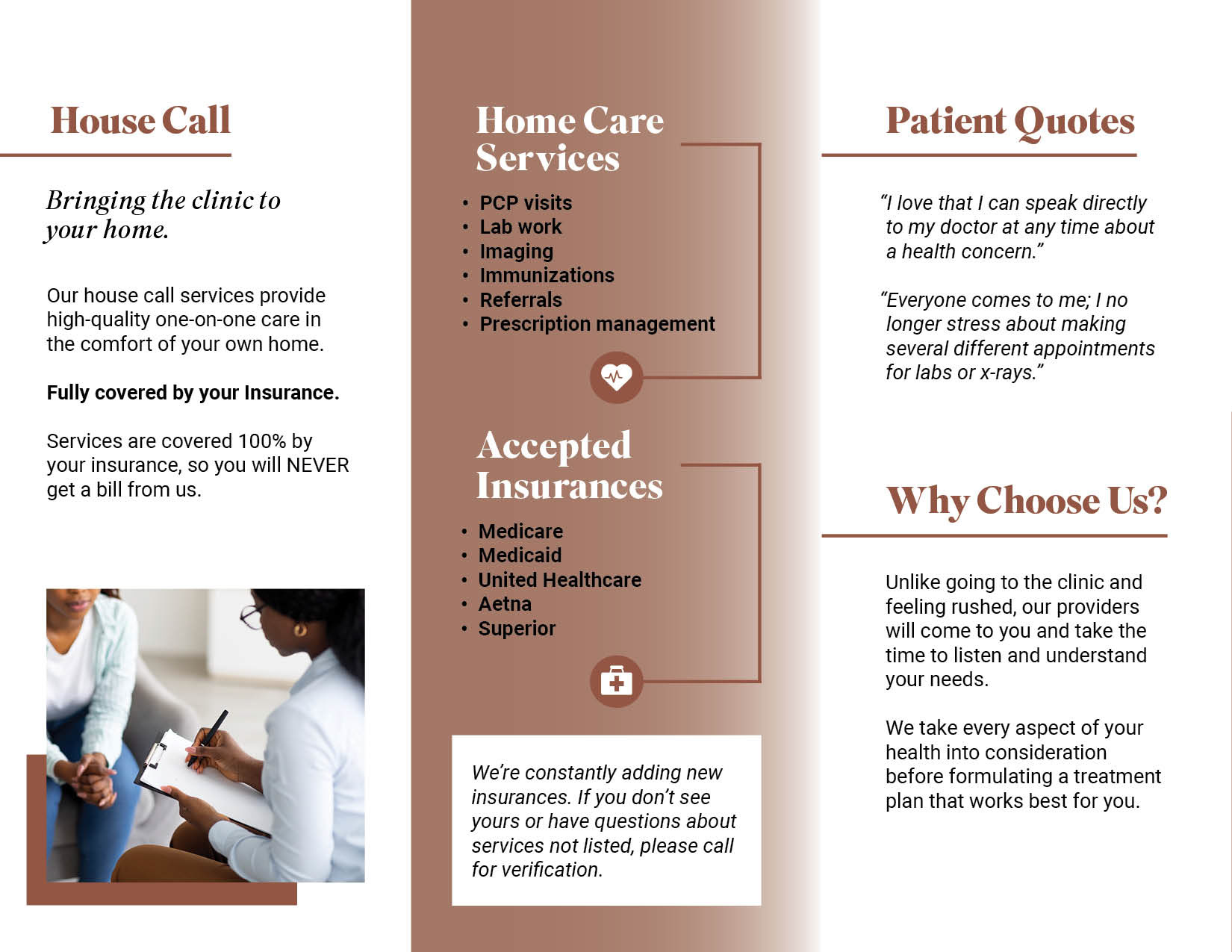
Final trifold brochure inside
FINAL DESIGNS
Not only is there a consistent brand look with the colors and fonts in both designs, but there is an element of surprise with the sourced images and icons. The rectangular shapes help with directing audiences in reading.
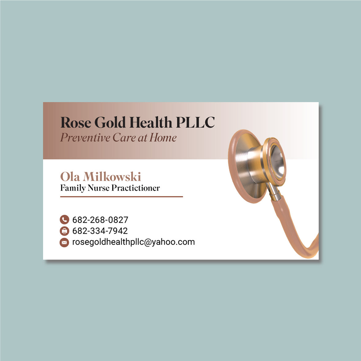
Business card
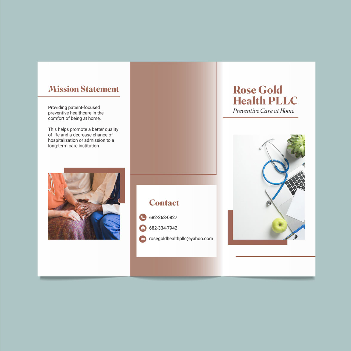
Trifold brochure front
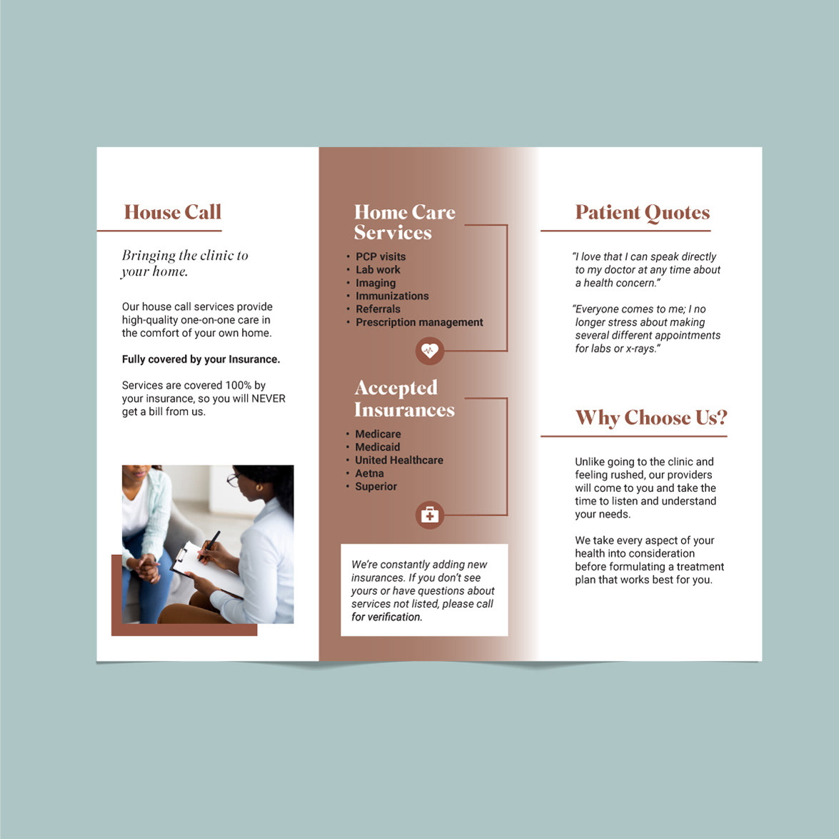
Trifold brochure inside
